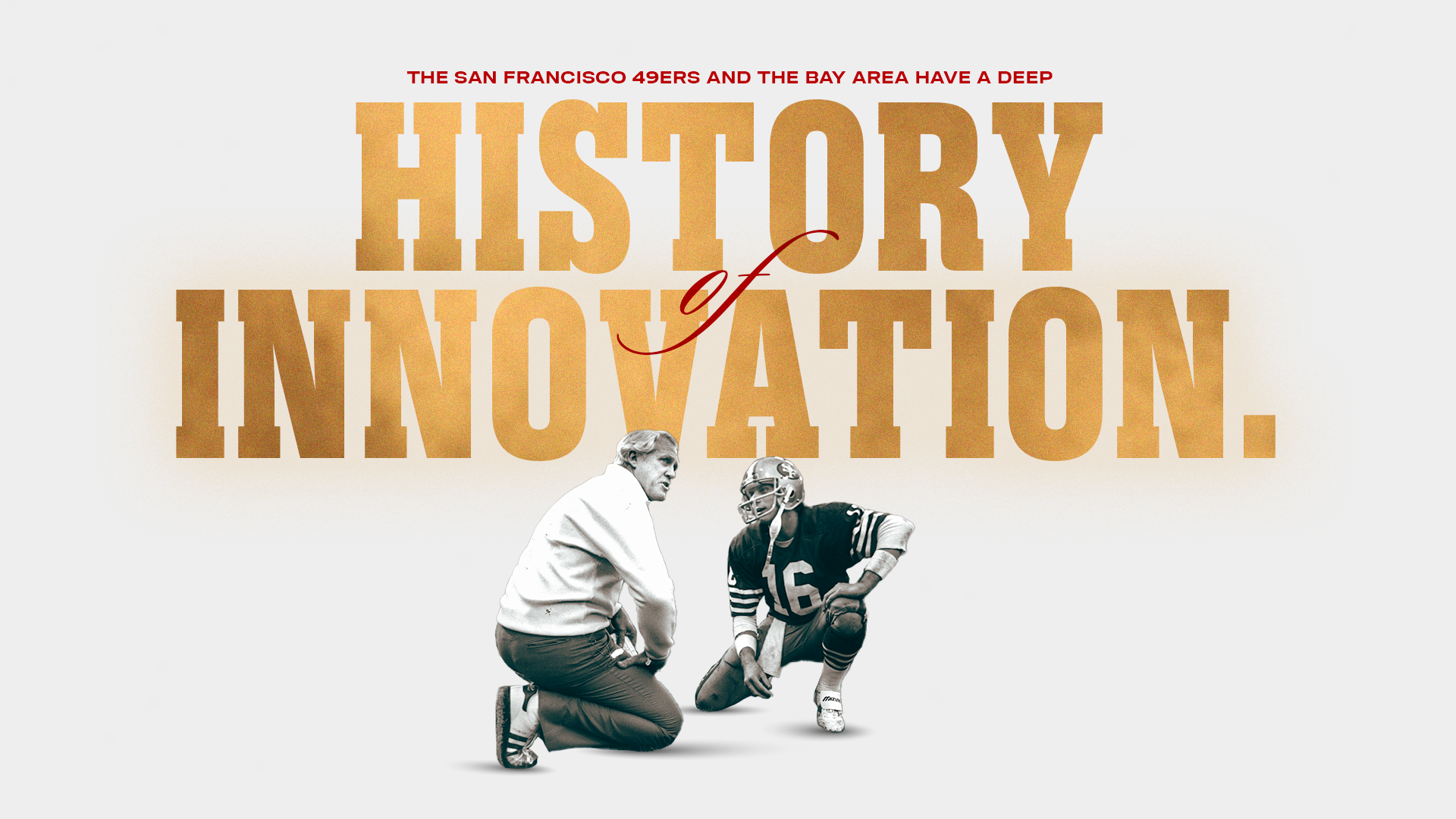
Embracing Our History of Innovation
The San Francisco 49ers have rolled out a refreshed brand kit ahead of the 2025 season.
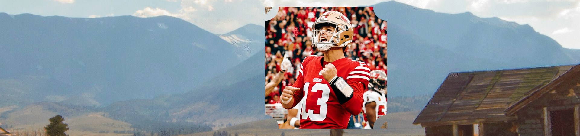
The 49ers Faithful may have begun to notice a change in the creative elements and visual themes across all digital platforms. These visual themes will be updated onto all social platforms, our team website, the official 49ers app, any email communications from the team and beyond. Additionally, some of these changes will be felt throughout the overall game experience in front of the best fans in the NFL inside of Levi's® Stadium.
The Versatile and Resilient Nature of Gold
Standing the test of time, gold is a symbol of lasting value and excellence. Gold takes many shapes and forms - it is malleable, resilient and resistant to corrosion. Gold carries textures that can both sparkle and shine.
For the 49ers, wearing gold is more than tradition – it is a reflection of the team's legacy and global appeal. It's a visual reminder of the standard we hold ourselves to and the work it takes to live up to it.

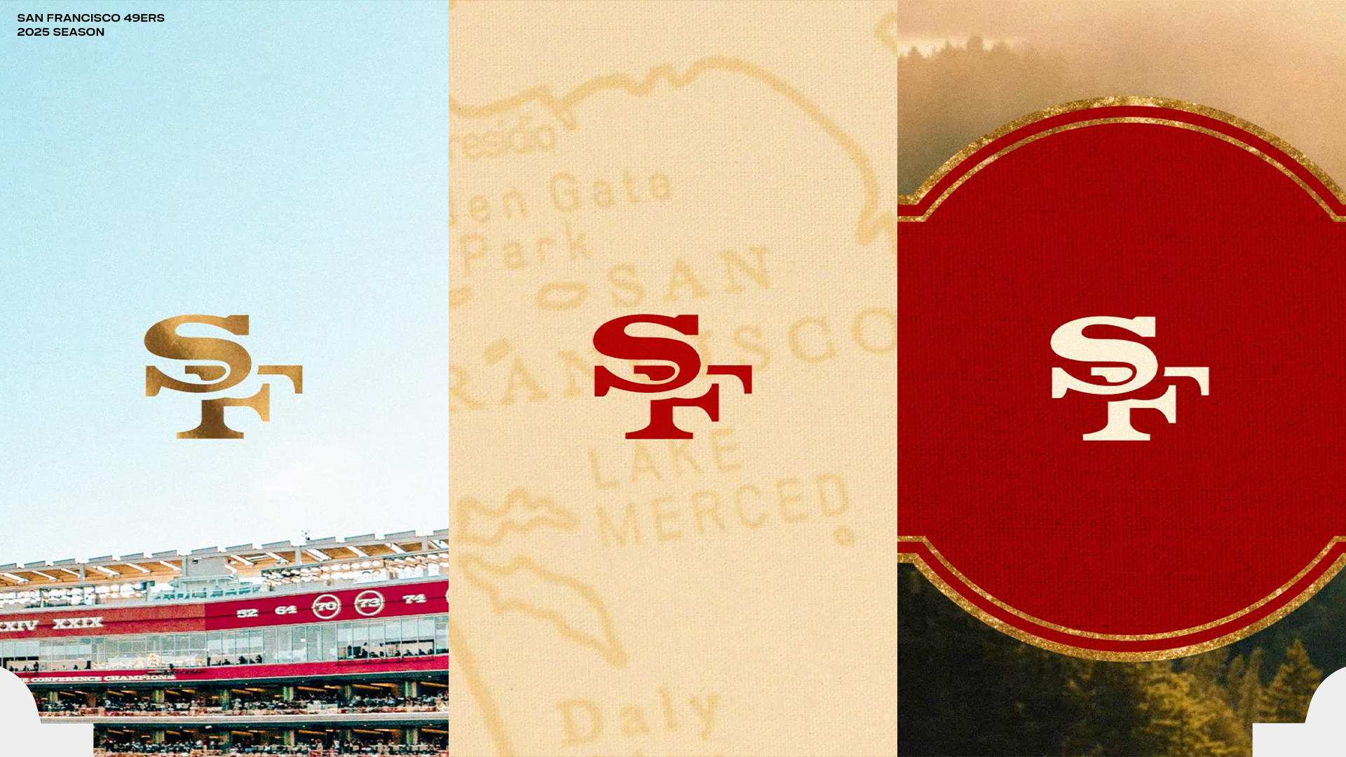
Floating SF
First appearing on 49ers helmets in 1962, the iconic SF logo originated without any outline border on the lettering as it sat centered in a bold red oval. The intertwined SF remained without a black border on the lettering until 1989. The core SF lettering, extracted from both borders and the oval, now serves as the signature element in the Floating SF logo. Simple, classic, and clean, the Floating SF takes the spotlight for an array of new 49ers design elements.

Faithful Script
The earliest history of San Francisco was often found penned in the Spencerian handwriting script that originated in the United States at the time of the 1849 Gold Rush. The spirit of the '49er and the devotion of The Faithful are embodied in the free-flowing Faithful Script. The font's fluidness serves as a connective anchor to the bold fonts and big ideas emblematic of our modern-day Golden State.

Northern California Landscapes in Vibrant Color
The 49ers color palette now draws from the rich landscapes throughout Northern California, and is coupled with the playful naming of the signature colors Montana Red, Primetime Black, Heritage Cream, and the Gold Rush Gradient.
These shades will also complement the color white, which is a mainstay within the 49ers uniform.

Western Container
From the Victorian homes lining the streets of San Francisco to the art deco landmarks known around the world in the city by the Bay, the shapes of the architecture of the West Coast are noted for fusing rounded edges with angular corners.
An homage to the end-zone clock which also served as a scoreboard at Kezar Stadium, the first home of the San Francisco 49ers, our Western Container is a frame for all manner of new imagery while carrying the various styles of our historic structures.

Mapping Out a Bold New Path
The prospectors and pioneers who flocked to Northern California in the mid-1800s relied on maps to navigate the trails in search of fortune. While many of those early trails and settlements have faded into history, their legacy lives on in the region's transformation—from gold mines to innovation hubs like Silicon Valley.
Our Map Texture design draws inspiration from that history, incorporating elements that reflect the movement, exploration, ambition, and growth that have shaped California. These textures nod to the journeys that brought generations here—many of whom are now part of the 49ers Faithful.